
A while back, I introduced my take on deployment diagrams for cloud and devops infrastructure. Some of the big points there are: it starts with intuitive drawings. Many people draw these things in similar ways, even without them having formal training.
In fact, formal training in architecture diagrams will not necessarily make those drawings easier to understand for the uninitiated.
But still. There are good drawings and there are drawings that can be improved.
My other big point is that deployment diagrams can be a great tool for security analysis. I am in some conversations with friends at banks who use them.
Recently I ran into the following example. Here is an explanation of the difference between VPC and security groups. Great story, but I have some comments on the diagram, which happens to come from AWS itself, by the way.
Here is the diagram.
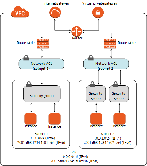
In my earlier post, I gave some informal principles for drawing these diagrams. In brief, they are:
- boxes denote ‘execution environments’ where code runs and data resides
- lines denote connections between those execution environments
- closed curves enclose ‘control boundaries’.
How does this diagram deviate from those principles?
Let me know…